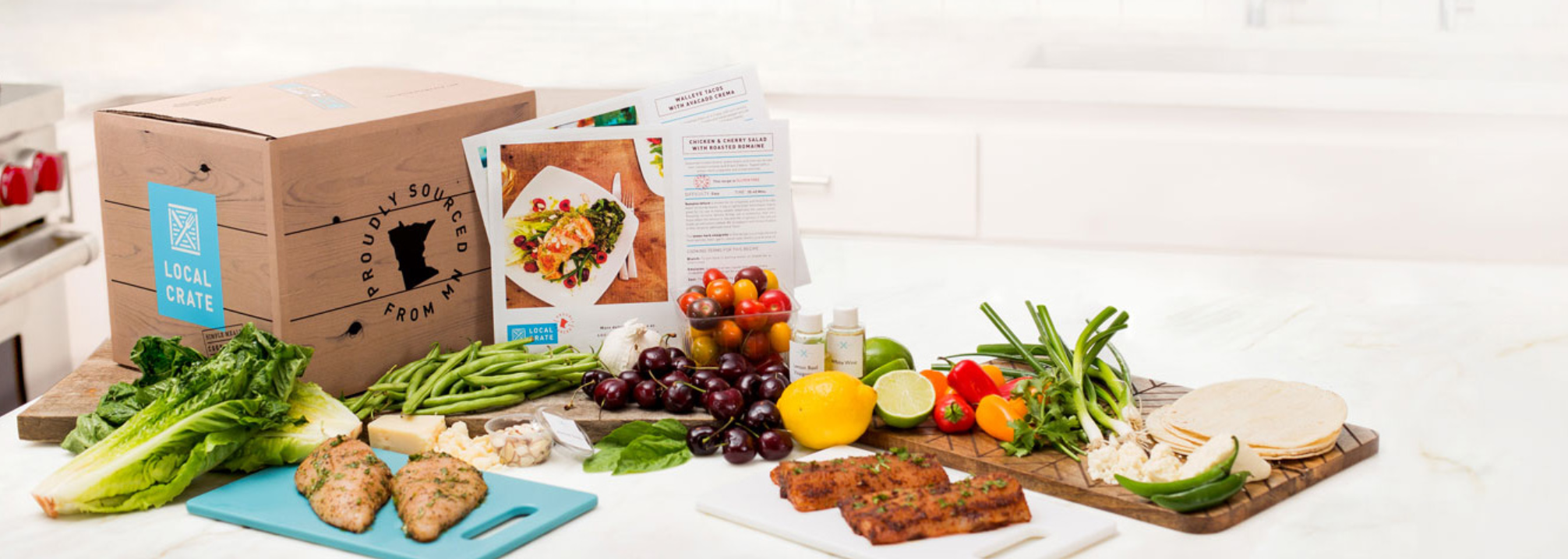
Local Crate is a meal delivery service with a subscription based web platform that is in need of a re-design.
Client identified objective:
Improve the user understanding of offer and value on the Local Crate website
To encourage new users to subscribe
Help current users with the modification and navigation
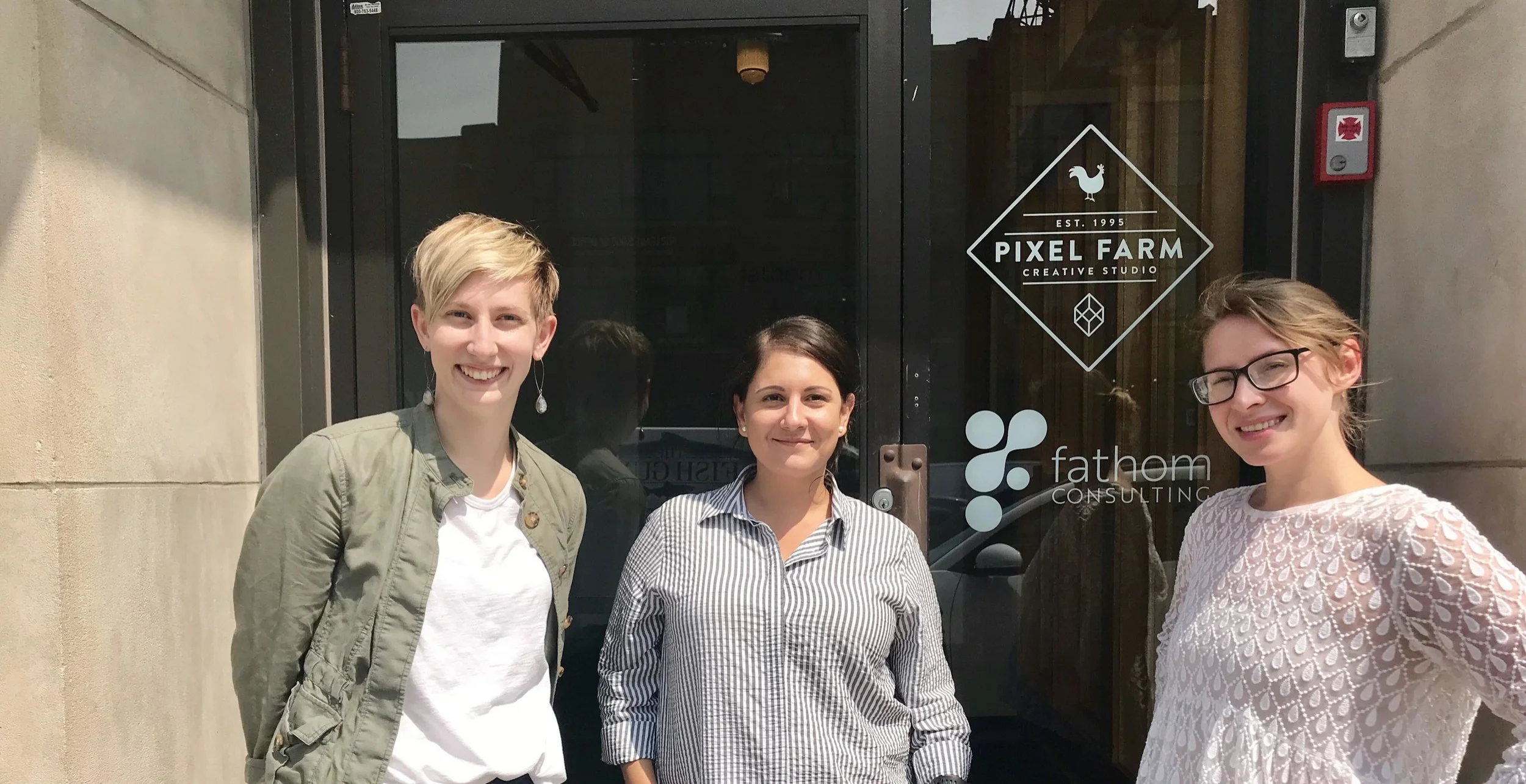
My team and I at Pixel Farm Creative Studio, where we conducted our Usability Testing Sessions. Leana, Anna, Svetlana (left to right)
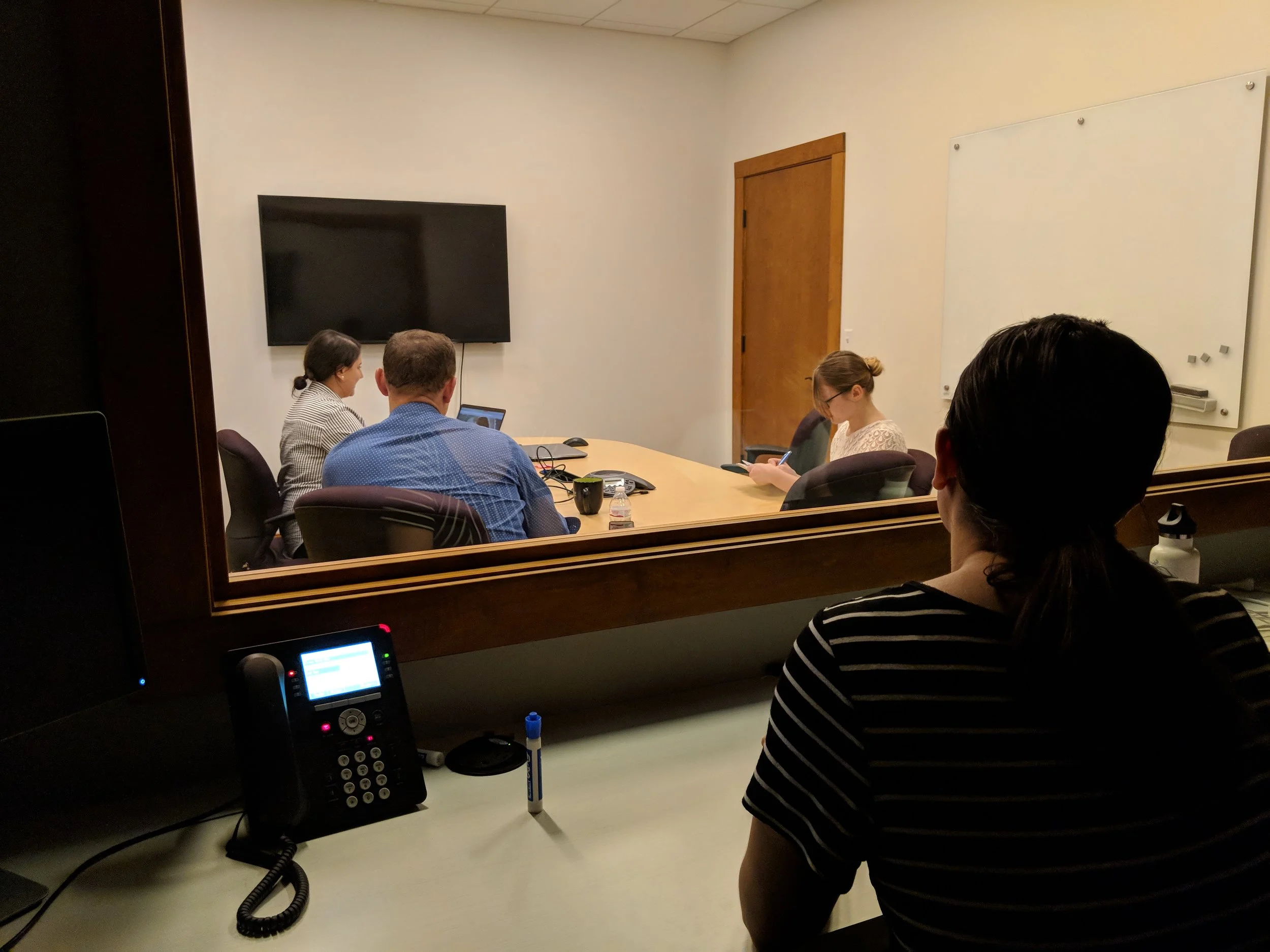
Usability Testing Room at Pixel Farms
Research and Evaluation Method
Heuristic Analysis: Ben Shneiderman's 8 Golden Rules Method
9 remote and in-person usability testing sessions
Insights
From our remote and in-person testing it was discovered that in order to improve the usability of the Local Crate website we had to make sure our users primarily understood the value and offer that Local Crate provides upon entering the site.
misleading sign up process for first time users
encountered several usability errors on the Local Crate site for current subscribers
our current subscribers could not change their credit card information
sign up page was confusing the user we tested with because it directed them to sign up for an account without understanding the product first
Evaluation Phase
allow the site to filter meals according to preference, as well as provide a further understanding of offers by including local vendors and farms
improve the sign-up process by giving the users information about the product
Prototypes
Prototypes included intentional changes to the current flow of the website. include a video of the local farmers and regional chefs describing the Local Crate service and their part in the company to build relationships with users in the local community and better understand the offer and value of Local Crate.
I included a menu to show the delicious meals Local Crate offers along with partnerships at the very bottom of the page.
I eliminated minor usability issues, such as having two "sign up buttons" and two "how it works" buttons.
I improved the hierarchy of navigation to guide the user through their preferences before selecting to add meals to their cart. This would allow the site to filter meals according to preference, as well as provide a further understanding of the offer.
Prototypes
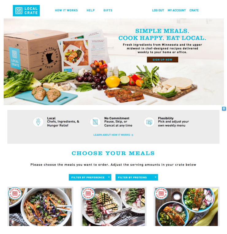
Current sign up page prompts users to meal selection before signing up for an account. This left users confused still unsure of how the service worked.
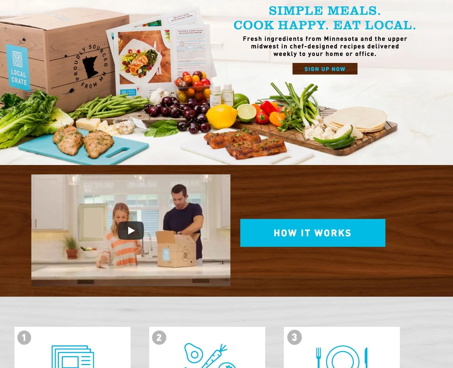
Current main page with repetitive "sign up/how it works buttons" and impersonal video that doesn't provide an effective tour to the potential subscribers.
New Homepage
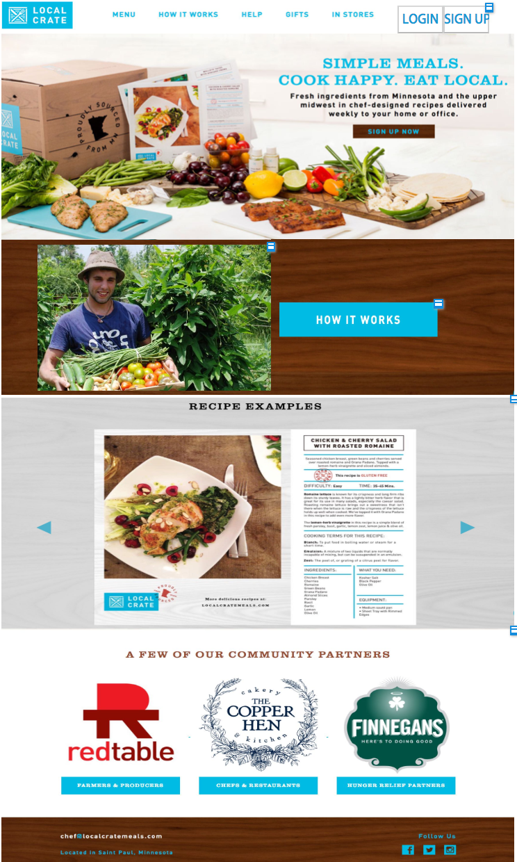
Building a relationship to the users and where their food comes from by showcasing the unique local aspect of Local Crate creates a personal connection to the user and the company.
New Sign Up Page
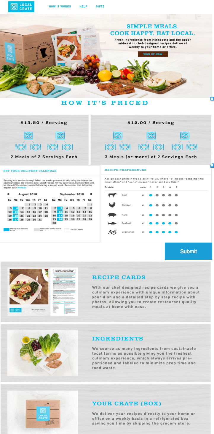
Choosing preference before meals gives the website an easy to follow rhythm that is intuitive and self explanatory.
FULL RECOMMENDATIONS REPORT:
https://www.dropbox.com/s/khxgq5jmsq9foqe/Local%20Crate%20Research%20Report%20.pdf?dl=0
RESEARCH:
https://www.dropbox.com/home/Local%20Crate?select=Local+Crate+Research+Report+.pdf